Thursday 25 October 2012

Détournement: Signs of the Times

I have come across an exhibition from earlier this year that features work composed of familiar signs that have been modified by iconoclastic artists. The exhibition was curated by Carlo Mcormick, senior editor of PAPER magazine.


"We live in a forest of signs that are meant to confuse, distract and numb us to the more dire consequences of the human condition as it is, we do not need to follow these signs, we need to make our own so as to find a way out of the mess we are in."


Wednesday 24 October 2012

The Design of Dissent

I've found some interesting social and political driven designs in this book, most of which are influenced from the conflicts of the middle east. Different designers from all over the world have used powerful and iconic images, such as logos and adapted them to convey poignant messages to the viewers. Here's a selection of some of the designs that immediately caught my attention, primarily because I understood the message through the visual language used...


The cigarette box below immediately get viewers' attention and allude to the idea of gas chambers, suggest that cigarette companies don't care if the kill you.


Mickey Mouse (head) has been used in quite a few designs I have been looking at. Both these designs suggest Mickey Mouse is a symbol of western cultural globalization, and specifically the design below that we are all 'targets' of consumerism.


Stencilled graffiti similar to Banksy, used to voice political discontent...


Tuesday 23 October 2012

Banksy

Banksy is probably the most popular, yet most mysterious,urban street artist in the world – and he works at incredible extremes. He has become an internationally known as a subversive graffiti artist – yet manages to maintain a secret identity. He is a counter-cultural prankster, but has art in major cosmopolitan galleries around the globe. Banksy’s work has sold to Hollywood celebrities for over a half-million dollars a piece, but much of his subvertising is freely (and illegally) drawn on public surfaces. He works against the mass media establishment, but has been featured in local, national, international news. He is on some level clearly a geek at heart but at the same time his art is always on the cutting edge.  

Source


Banksy in the Streets: Banksy is a household name in the UK, perhaps best known for his compelling stencil graffiti, found throughout major cities on walls and billboards. He avoids the abstraction of traditional tags, instead creating (often photo-realistic) urban street art images that respond to a given context and contain some form of social commentary. Of course, these are all highly illegal, which is part of the reason Banksy shields his identity.


Similar to the style of Kruger, I like how Banksy takes these innocent 1940's/1950's style photographs and deforms them in such a contrasting way to present new meaning. I think his unknown presence and mysterious celebrity like persona makes his social and political views all the more interesting. It's hard for the viewer to make judgement on someone when their personality is hidden, but it's not as easy to deter from the controversial stencils when they are being plastered around London. In that respect, I find Banksy's method of commercialising rather intriguing - reminiscent of the way the punk subculture would express their views on similar subject matter. One thing that does stand out about some of Bansky's stencils, is the way he makes them appear as though they are interacting with the wall/surface. He takes something natural and builds around it, which gives it this often deteriorated aesthetic, in conjunction with the point he is communicating.

Monday 22 October 2012

Viktor Hertz - Honest Logos 2011

A more recent take within the theme of detournement are these logos designed by Swedish Graphic Designer Viktor Hertz. Unlike Adbusters, most of these logos are simply for recreational purposes, however, I think they still have a lot of merit for the way the message is cleverly communicated with just a few (or even one) words.

"An idea for a series with honest logos, revealing the actual content of the company, what they really should be called. Some are cheap, some might be a bit funny, some will maybe be brilliant. I don't know".


Barbara Kruger


Barbara Kruger was born in Newark, New Jersey, in 1945. After attending Syracuse University, the School of Visual Arts, and studying art and design with Diane Arbus at Parson’s School of Design in New York, Kruger obtained a design job at Condé Nast Publications. Working for Mademoiselle Magazine, she was quickly promoted to head designer. Later, she worked as a graphic designer, art director, and picture editor in the art departments at House and Garden, Aperture, and other publications. This background in design is evident in the work for which she is now internationally renowned. She layers found photographs from existing sources with pithy and aggressive text that involves the viewer in the struggle for power and control that her captions speak to. In their trademark black letters against a slash of red background, some of her instantly recognizable slogans read “I shop therefore I am,” and “Your body is a battleground." Much of her text questions the viewer about feminism, classicism, consumerism, and individual autonomy and desire, although her black-and-white images are culled from the mainstream magazines that sell the very ideas she is disputing. As well as appearing in museums and galleries worldwide, Kruger’s work has appeared on billboards, buscards, posters, a public park, a train station platform in Strasbourg, France, and in other public commissions. She has taught at the California Institute of Art, The School of the Art Institute of Chicago, and the University of California, Berkeley. She lives in New York and Los Angeles.

Source


Barbara Kruger - Untitled Questions


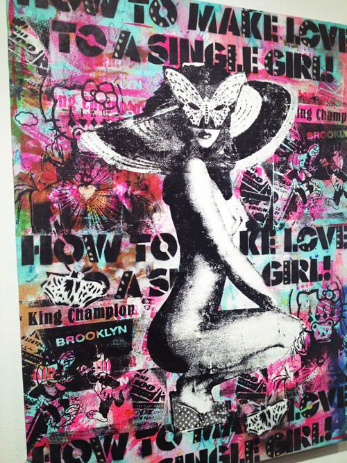
The way in which Kruger juxtaposes the black and white imagery, (usually suggesting fun and endearment) and then pastes over the top in bold heavy typography, is reminiscent of the punk designs I mentioned previously. She takes something so simple and gives it a whole new meaning by the way in which she positions one element with its contrasting counterpart, resulting in an enigmatic response.

Dove Campaign for Real Beauty


I studied this 'dove evolution' advertisement during in my second year of college. It is basically a time-lapse video that shows how a girl ('real' woman) is transformed using make-up and Photoshop to suggest an 'ideal' female representation of the way in which perhaps celebrities are idolised by the media. The campaign plays on the themes of low self-esteem and lack of confidence in women. The way in which the filming has been speeded up in juxtaposition with the music as this girl is transformed shows how easily the viewers perception of someone can change instantly and begins to question our beliefs in what we are being shown by the media and how they affect our judgement on such topics.

In addition, Unilever, the company that owns dove, was criticised for contradicting this campaign by 'sexualising' women in their later Lynx advertisements!

Ad Busters


'Based in Vancouver, British Columbia, Canada, Adbusters is a not-for-profit, reader-supported, 120,000-circulation magazine concerned about the erosion of our physical and cultural environments by commercial forces. Our work has been embraced by organizations like Friends of the Earth and Greenpeace, has been featured in hundreds of alternative and mainstream newspapers, magazines, and television and radio shows around the world.
Adbusters offers incisive philosophical articles as well as activist commentary from around the world addressing issues ranging from genetically modified foods to media concentration. In addition, our annual social marketing campaigns like Buy Nothing Day and Digital Detox Week have made us an important activist networking group.

Ultimately, though, Adbusters is an ecological magazine, dedicated to examining the relationship between human beings and their physical and mental environment. We want a world in which the economy and ecology resonate in balance. We try to coax people from spectator to participant in this quest. We want folks to get mad about corporate disinformation, injustices in the global economy, and any industry that pollutes our physical or mental commons'.

Source

Here are some 'spoof ads' whereby the designer has taken a well-known identity or brand and subverted it to reveal an opposing opinion on what they believe the company is selling to it's consumer. The shocking nature of the images are quite compelling but arguably have merit to be true.

Tabula Rosa, 2004. Borjana Ventzislavova, Miroslav Nicic & Mladen Penev.

Design by Pedro Inoue (coletivo.org). This spoof ad appeared in Adbusters #87

This spoof ad appeared as the back cover of Adbusters #44


Monday 15 October 2012

L.H.O.O.Q. 1919

French artist Marcel Duchamp is often associated with his work during the Surrealist movement which he referred to as 'readymades'. These would usually be ordinary manufactured objects which Duchamp would tweak slightly, or reposition before signing and naming them art.

L.H.O.O.Q is a cheap postcard reproduction onto which Duchamp drew a moustache and beard in pencil and amended the title. Although this might not be defined as detournement as such, it enforces the idea of taking two elements and positioning them in a way that is somewhat an alteration from the original to form a completely distorted representation. The aesthetic and meaning of this is also reminiscent of modern graffiti art.

Source


...and the instantly recognisable fountain...


Détournement

I've decided to start looking into how some contemporary creative's have taken an antithetical approach to their work and find out who and why appreciates design that is somewhat détourned.

An informative guide from as early as 1956, when the technique was introduced...


"Any elements, no matter where they are taken from, can serve in making new combinations".